Fall Color Trends 2026: 10 Designer Shades and How to Test Them on Your Room
Fall color trends 2026 from designer forecasts — chocolate brown, oxblood, dusty yellow, navy and six more — plus how to preview each direction on your own room.
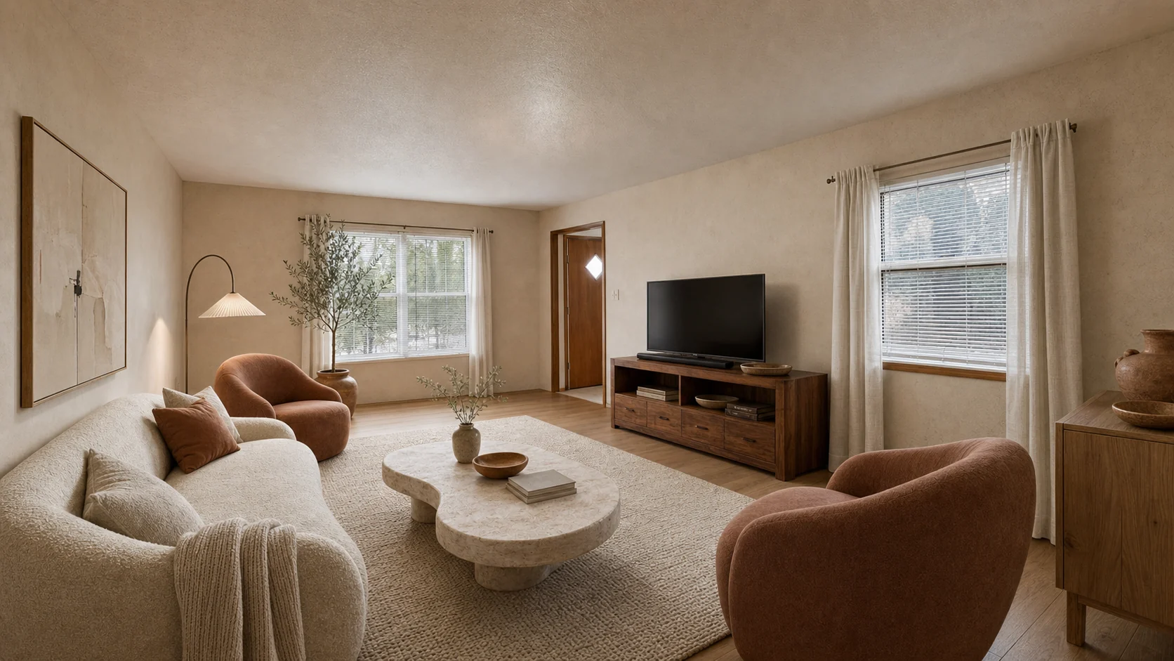
Every September the same question comes back: is this the year you finally repaint, or just swap the pillows? Fall color lists are a seasonal ritual — design media publish one every year — and the 2026 editions are unusually aligned. Homes & Gardens’ fall color report (published August 17, 2026; we checked it on September 13, 2026) asks working designers which shades they are actually specifying, and the answer is a palette with real depth: chocolate brown, oxblood, dusty yellow, deep navy, and six more shades that treat color “as part of the architecture rather than something confined to cushions.”
This page does two things a listicle cannot. First, it turns the ten shades into a decision table — what each color does, where designers are putting it, and how much commitment it demands. Second, it shows how to preview a warmer direction on a photo of your own room before you buy paint, using samples generated by our own tool.
The 10 fall colors for 2026, condensed
All ten shades below come from the Homes & Gardens designer interviews. The “commitment” column is ours — it answers the question the original list leaves open: how hard is this to undo if you hate it in January?
| Shade | What it does to a room | Where designers used it | Commitment |
|---|---|---|---|
| Chocolate brown | Grounding warmth; the successor to beige | Lower kitchen cabinetry, color-drenched small rooms, large wool rugs | Medium |
| Straw / dusty yellow | Keeps summer’s optimism, muddied and softened | Accent walls, high-gloss floors, rooms with warm wood | Low–Medium |
| Maroon | Deep red that envelops without overwhelming | Cabinetry, built-ins, dressing rooms | Medium |
| Terracotta | Fired-clay warmth that flatters texture | Plaster and tadelakt walls, living rooms, bedrooms | Medium |
| Oxblood | Brownish burgundy; jewel-box mood | Libraries, bars, bedrooms — walls, trim, and ceiling together | High |
| Dusky mauve | A grown-up pink with a mud-red undertone | All four walls plus ceiling in bedrooms | Medium |
| Tomato red | Warm, energetic red with an orange undertone | Joinery, an armchair, curtains, lampshades | Low |
| Bottle green | Forest-deep green; grounding with natural materials | Cabinetry, statement tile, upholstered pieces | Medium–High |
| Smoky violet | Cool, calming blue-purple with personality | Layered monochromatic schemes | Medium |
| Navy blue | The dependable dark; “cozy academia” | Built-ins, studies, anchor for jewel tones | Medium |
The through-line is depth over novelty. None of these shades is a gimmick, and most are darker, earthier versions of colors you already know — which is exactly why they survive past one season.
Browns and reds carry the season
Five of the ten shades sit in the brown-to-red band, and the designers quoted in the report treat them differently than past years’ accents. Uns Hobbs calls chocolate brown “a key color this autumn,” using it as a grounding neutral under cream cabinetry with small hits of pale blue and pink to keep it from turning serious. Zoë Feldman’s pick in the same family, Farrow & Ball’s ‘Salon Drab’, “shifts between chocolate, olive, and charcoal depending on the light” — a useful reminder that dark browns are light-sensitive, so a color that reads warm at noon can go near-black at night.
Oxblood is the commitment play. KOBEL + CO describe it as “moody and enveloping yet retaining a sense of warmth,” and their advice is to commit fully — walls, trim, cabinetry, and ceiling in one color for libraries, bars, and bedrooms. If four oxblood walls sound terrifying, they suggest the lighter route: upholstery, patterned textiles, lampshades. Michelle Gage makes the same argument for maroon (Benjamin Moore’s ‘Radicchio’ on cabinetry), calling it “both moody and somewhat feminine at the same time.” And Lizzie Green’s tomato red is the low-risk entry point — an orange-leaning red that works in cushions, ceramics, or a single piece of painted joinery without darkening the room.
Terracotta rounds out the warm band. Cath Beckett of Yellow London calls it “a warming color for a cozy room,” and notes it changes character depending on its neighbors: quiet next to earthy neutrals, bold next to jewel tones.
The cool end is deeper than usual
Fall palettes usually stop at warm shades; 2026’s cool entries are worth attention because they are darker than the sages and sky blues of recent years. Andrea Goldman frames bottle green as part of a broader demand for homes that feel “warmer, more intimate and more personal,” and she puts deep color where it will actually be experienced — walls, cabinetry, tile, a serious upholstered piece — rather than in disposable accessories.
Rayman Boozer’s smoky violet (he names Benjamin Moore’s ‘Flower Box’) is the outlier: a blue that drifts purple, calming but with personality, layered with neighboring blues and plums instead of contrast. Rebecca Letwin’s navy — Benjamin Moore’s ‘Mysterious’ on a built-in — is the safest dark of the ten, pairing with oak, walnut, brick, brass, and cognac leather. If you want one fall update that will not read as “a 2026 room” in three years, navy is the conservative pick.
Preview the direction on your own room first
A written list can tell you what chocolate brown does in a designer’s project. It cannot tell you what it does in your north-facing living room with the orange-toned floor. That gap is where most fall repaints go wrong.
Our approach: upload one photo, pick a direction, and compare versions of your actual room. The samples below were generated by AI Interior Lab on the same anonymous source room — different directions, identical viewpoint — which is exactly the comparison worth doing before you buy paint.
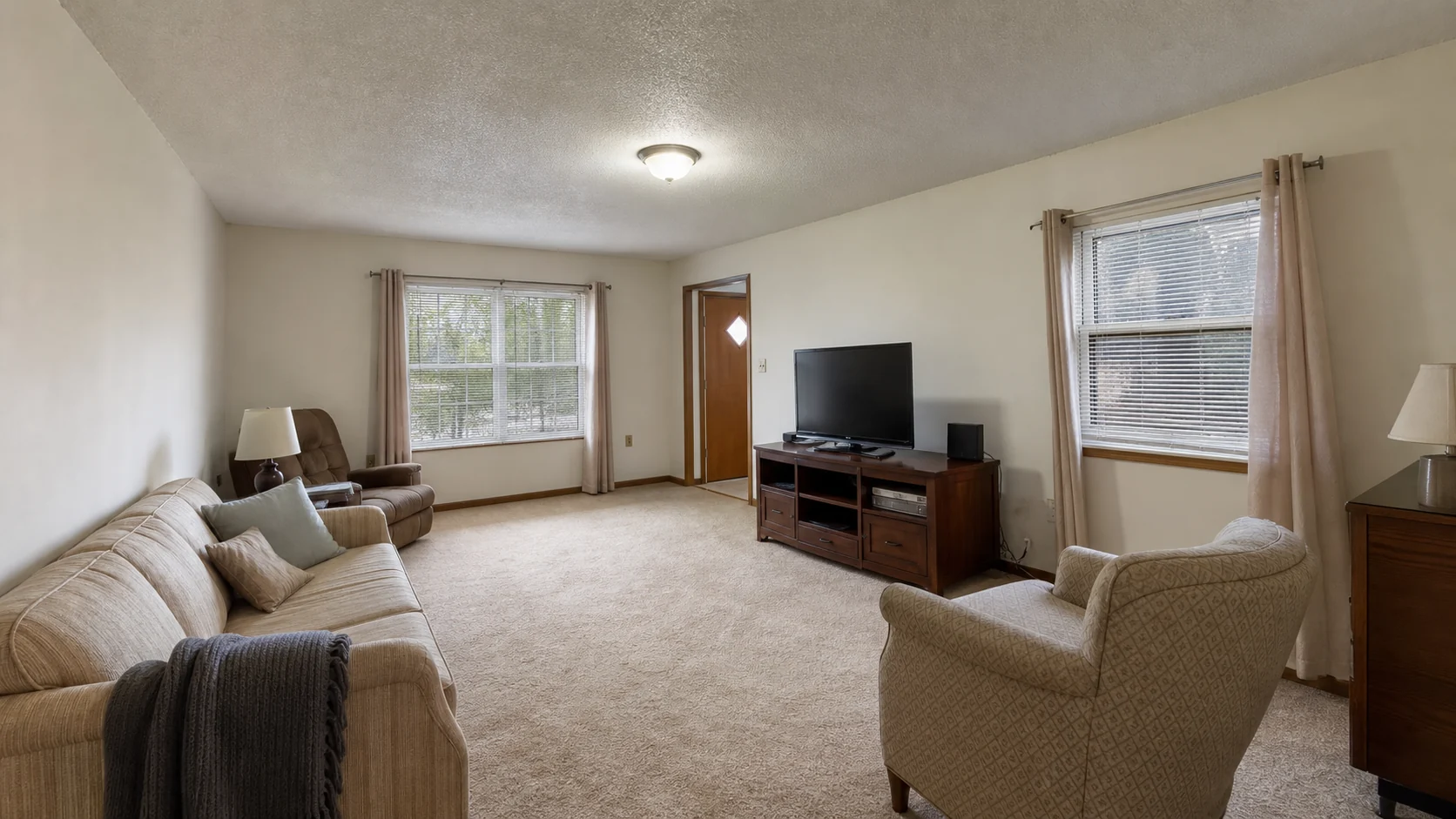
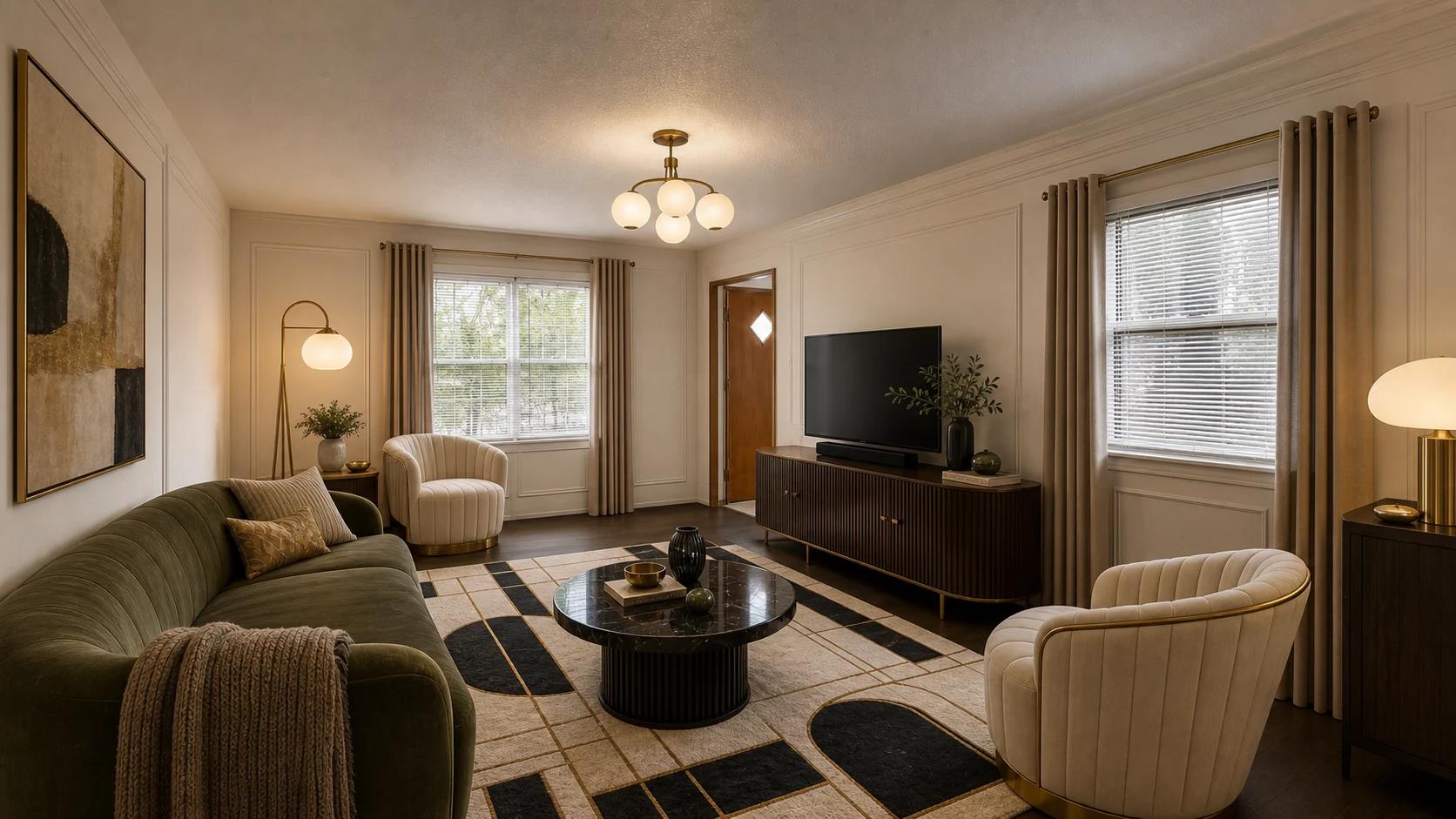
The style gallery walks through more directions (Japandi, mid-century, Scandinavian) on this same room. When you are ready to test your own space, the room designer generates candidates from a single photo, and the AI room design generator is the fastest path from one picture to a finished direction.
How to use a fall palette without repainting twice
The designers in the source report converge on one principle: commit where it counts, sample everywhere else. Translated into a workflow:
- Start on removable layers. A tomato-red lampshade or dusty-yellow cushion is a $40 experiment. Paint is a weekend. Cabinetry is a commitment. Move up the ladder only when the cheaper test survives a week of living with it.
- Respect the ratio. A fall accent works when it stays near 10 percent of the room. Our interior color palette ratios guide covers the 60-30-10 split and undertone checks that keep a bold shade controlled.
- Mind your light. The report’s own examples underline it: brown that reads chocolate at noon can read charcoal after sunset, and dusty yellow was chosen precisely because it responds well to shifting desert light. Check any candidate shade morning and evening before committing.
- One brave move per room. An oxblood library works because the rest of the house stays calm. Color-drenching every room is how a palette becomes a theme park.
- Think past December. The report’s own closing test is the right one: choose shades with enough complexity to work after the leaves drop. Chocolate brown, navy, and bottle green clear that bar easily; tomato red and straw yellow do it in small doses.
If you are planning beyond this season, our 2026 interior design trends brief tracks the year-round style and color forecasts — this page is the fall working palette, that one is the full-year map.
FAQ
What colors are trending for fall 2026? Designers interviewed by Homes & Gardens named ten: chocolate brown, straw/dusty yellow, maroon, terracotta, oxblood, dusky mauve, tomato red, bottle green, smoky violet, and navy blue. The common thread is depth — darker, earthier versions of familiar colors rather than novelty shades.
Is brown really replacing gray and beige? In designer work, yes — the report frames chocolate brown as the warmer successor to years of pale neutrals. The practical reading: brown now plays the “grounding neutral” role gray used to, pairing with cream, pale blue, ochre, and aged brass instead of cool white.
How can I try fall colors without painting? Start with textiles and objects (a tomato-red lamp, an oxblood cushion, a straw-yellow throw), then preview painted directions on a photo of your actual room. AI Interior Lab generates those previews from one uploaded photo, so you can compare a chocolate-brown feature wall against a navy built-in before spending on paint.
Which fall 2026 color works in a small room? Counterintuitively, the dark ones — the report shows oxblood and maroon working specifically in small rooms when you color-drench (walls, trim, and ceiling in one shade), which removes visual breaks and makes the room feel enveloping rather than cramped. If that is too bold, dusky mauve across all walls plus ceiling is the softer envelope.
Will these colors look dated by next year? The safest shades — chocolate brown, navy, bottle green, terracotta — are darker classics rather than inventions, which is why designers are comfortable specifying them. The riskier, more seasonal reads (tomato red, straw yellow) belong on removable layers you can swap when the palette rotates.
Sources
- Homes & Gardens: “Forget Pumpkin Spice, These 10 Fall Color Trends Are Set to Define Homes This Season” — published August 17, 2026; accessed September 13, 2026. All ten shades, designer names, and quoted paint colors above come from this report.
Room samples on this page were generated with AI Interior Lab’s own tool on an anonymous source room; they illustrate how to preview a direction and are not the designers’ projects shown in the source article.
Test the direction on your own room
The guest path creates one public, watermarked 1K preview after explicit consent. Sign in and use Credits when the room needs to stay private or you want to refine versions.
Open Studio