2026 Interior Design Trends: Styles and Color Forecasts
2026 interior design trends worth using: emerging styles like quiet luxury and warm minimalism, plus the year's color forecasts and best rooms for each.
I spent a Saturday scrolling through “2026 trends” listicles and came away more confused than inspired. One promised ten must-have looks; the next declared neutrals dead; a third showed a dining room that looked like a disco. If you have a real room to redo, most of those roundups are noise. What you actually need is a short list of styles that are emerging (not just recycling 2024), the concrete colors designers are forecasting, and a way to see them in your own space before you buy a single can of paint.
Three sources line up closely this year. The American Society of Interior Designers (ASID) 2026 Trends Outlook calls the mood a “Maximalism Returns” swing toward saturated color and visible personality. Vogue’s January 2026 color report says the “sad beige era is officially over.” House Beautiful’s 2026 preview agrees: “neutrals are on their way out, and maximalism is back.” Below is the version you can actually use.
Why 2026 feels different from the last few years
The shift is not “everything beige to everything neon.” It is a move from restraint toward intention. After several years of pale, near-colorless rooms, designers are reintroducing color — but through layers you can swap, not permanent commitments. ASID’s report frames it as confidence: “bold beauty choices signaling confidence and individuality,” with cobalt blue called out as a standout hue of the year’s maximalist swing.
The practical takeaway: 2026 rewards personality without demanding a full gut renovation. A room can stay in its existing neutral bones and still feel current with the right accent color, one collected object, or a warmer material palette.
Emerging styles worth knowing
These are the styles showing up across trade reports and paint forecasts. The table rates each by how fast it can date your home, so you know what to commit to versus what to sample.
| Style | What defines it | Best room | Date-risk |
|---|---|---|---|
| Quiet luxury | Muted, high-quality materials; restraint over ornament | Living room, primary bedroom | Low |
| Warm minimalism | Soft neutrals, tactile fabrics, less sterile than 2020s minimal | Whole home | Low |
| Japandi | Warm wood, soft neutral, low clutter, handmade texture | Bedroom, reading nook | Low |
| Organic modern | Plaster, stone, oak, rounded furniture, warm neutrals | Living room | Low–Med |
| Aged & raw materials | Patina, unlacquered brass, lived-in surfaces | Kitchen, bathroom | Low |
| Moody maximalism | Saturated color, pattern, collections on display | Dining room, home office | Med |
| Refined coastal | Linen, blue accents, airy natural materials | Bedroom, sunroom | Med |
Notice how many of these map to tried-and-true style families rather than brand-new inventions. If you want to test them on a real photo, our style gallery previews Japandi, organic modern, mid-century, and more against your own room.
Interior color trends 2026: the forecasts, named
Paint brands publish their own forecasts, and they cluster around the same idea: warmer, earthier, and a little braver. Sherwin-Williams’ 2026 Colormix Forecast “Anthology Volume Two” organizes 48 hues into four curated palettes built around evolving color families. Vogue’s designers named six colors they expect everywhere in 2026:
| Color | Mood | Where to use it | Pairs with |
|---|---|---|---|
| Earthy umber | Grounding, warm “hug” | Feature wall, large furniture | Wood, cream |
| Pistachio–chartreuse | Playful, fresh, eye-catching | Rug border, throw pillows | All neutrals |
| Desaturated sky blue | Calming, versatile | Bedroom, bathroom | Neutrals, wood tones |
| Ochre | Sunbaked, lived-in | Dining room, kitchen island | Antiques, modern pieces |
| Red / burgundy | Confident, brave | Powder room, dining accent | Brass, cream |
| Lemon-vanilla | Soft, surprising neutral | Trim, kitchen | Bolder colors |
The through-line is “warm and a little unexpected.” Lemon-vanilla is a 2026 way to do white without the cold sterility of the last decade; earthy umber anchors a room the way cool gray used to. If you want the full palette logic, our interior color palette ratios guide explains how to balance these into a 60-30-10 split so a bold accent stays controlled.
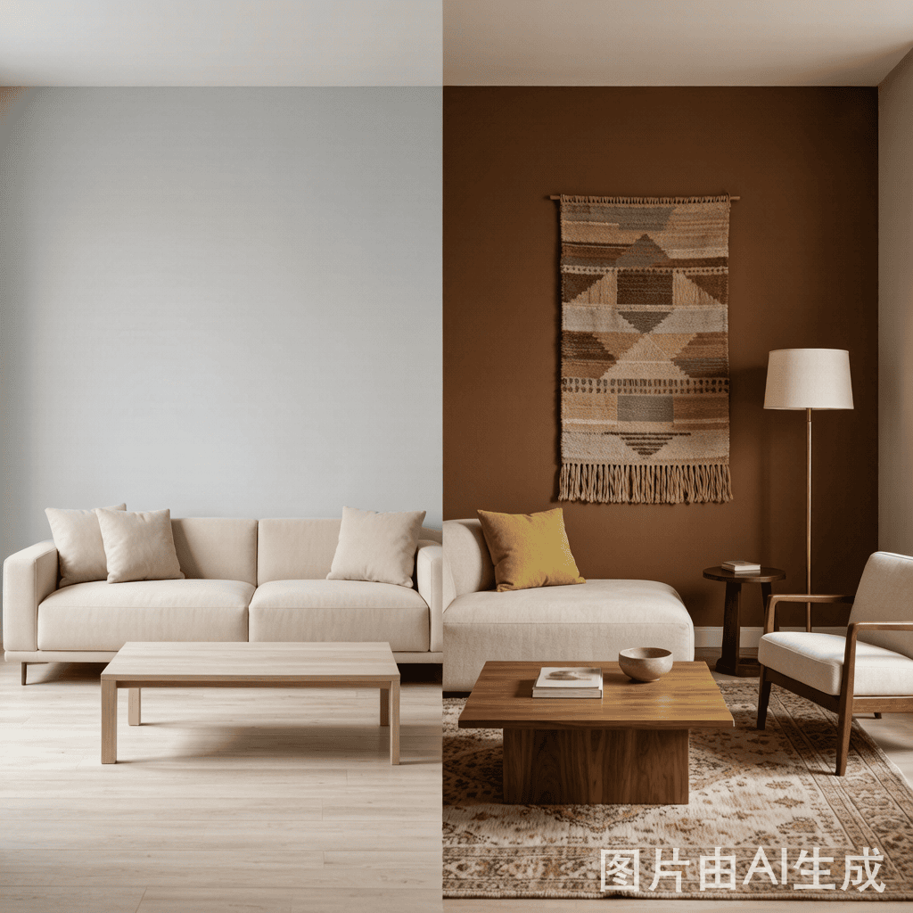
Watch the trends explained in 20 minutes
Designer Shea McGee walks through what she is actually specifying for 2026 clients — useful because it shows the styles above in real rooms, not staged sets.
The clip is a good reality check: most of what reads as “trend” in a listicle is really just a warmer, more personal version of a room you already have.
How to use 2026 trends without dating your home
ASID’s Outlook notes that 2026 buyers are “more selective, value-conscious, and outcome-driven” — they concentrate spending on spaces that deliver long-term value, not scale. Translate that to your own project:
- Spend trends on removable layers. Paint, textiles, lamps, and accessories are cheap to replace. A chartreuse pillow reads as 2026 today and costs nothing to swap in 2028.
- Keep big-ticket items in enduring neutrals. Sofa, cabinetry, and flooring should outlive the trend cycle. Let a $60 throw carry the color, not a $3,000 sofa.
- Use one brave move per room. Pick a single saturated moment — a powder-room red, an ochre island — and let everything else stay calm. That is the difference between “designed” and “themed.”
- Preview before you commit. The fastest way to know if earthy umber works in your living room is to see it there, not in a showroom. Our guide on using AI to redesign a living room covers a low-risk workflow for testing palettes on a real photo.
The goal is a room that feels current in 2026 but still looks right in 2029. Trends you can undo are trends you can afford.
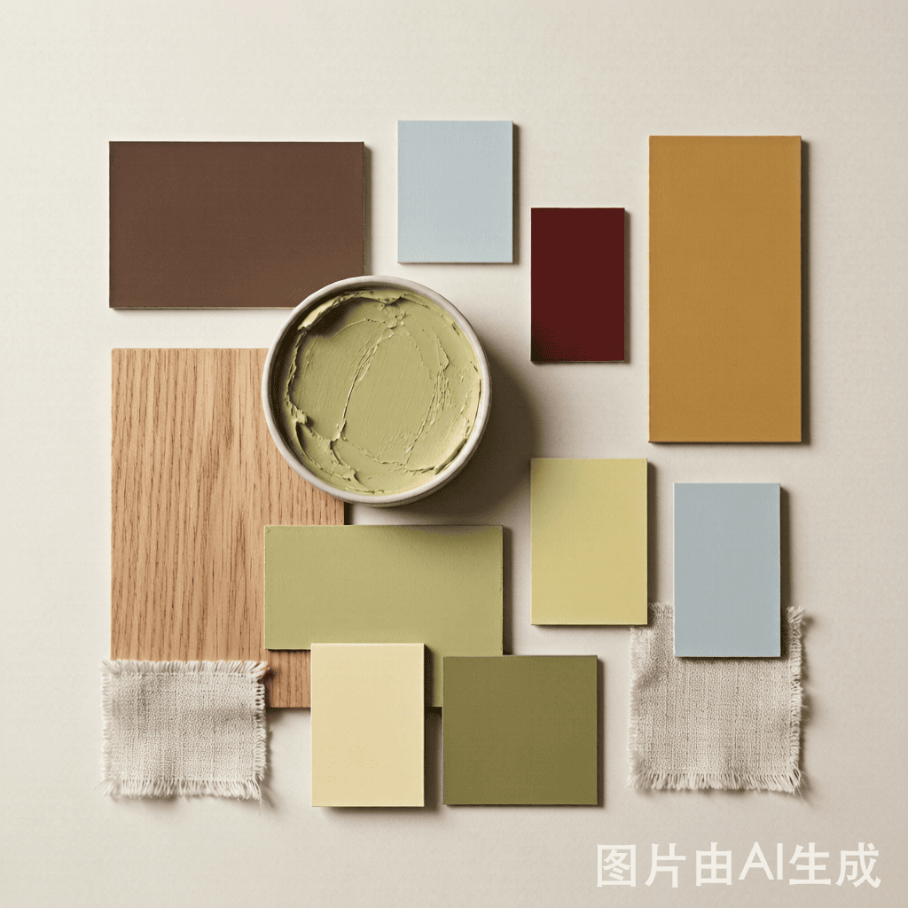
See the trends on your own room
Reading about a style is one thing; seeing it in your actual space is another. Upload one room photo, choose a direction — Japandi, organic modern, warm minimalism — and compare 1, 2, or 4 candidates side by side in the room designer. You get photorealistic previews of the 2026 looks above, using your own walls, windows, and furniture, before you spend on paint or pieces.
Start with the lowest-risk move: pick one accent color from the forecast table, preview it on a feature wall, and decide from there.
FAQ
What are the biggest interior design trends for 2026? The clearest through-lines are a return of saturated color and “maximalism with intention” (ASID 2026 Outlook), warmer neutrals replacing cool gray, and material honesty — aged brass, plaster, stone, and lived-in wood. Styles like quiet luxury, warm minimalism, Japandi, and organic modern stay safe; moody maximalism is the higher-risk, higher-reward choice.
What colors are trending in interior design in 2026? Designers named earthy umber, pistachio–chartreuse, desaturated sky blue, ochre, red/burgundy, and lemon-vanilla as the colors to watch (Vogue, Jan 2026). Sherwin-Williams’ 2026 Colormix Forecast gathers 48 hues into four palettes. Cobalt blue is the standout “maximalist” accent hue per ASID.
Is maximalism really back in 2026? Yes, but the useful version is curated, not cluttered. ASID’s report describes a swing “back toward boldness and individuality” after years of restraint, and multiple shelter magazines echo it. The safe way to join in is one confident color or pattern per room, not an everything-at-once overhaul.
How do I use 2026 trends without making my home look dated? Put trends on removable layers — paint, pillows, lamps, art — and keep large investments (sofa, cabinetry, floors) in enduring neutrals. Preview bold colors on a real photo before committing, and limit each room to a single brave moment so the space stays balanced.
Which 2026 trend works best for a small apartment? Warm minimalism and Japandi travel best in small spaces: they add warmth through wood and soft neutrals without visual noise. A single desaturated sky blue wall or one ochre accent gives personality without crowding the room. Avoid heavy maximalism, which reads as busier in tight square footage.
Test the direction on your own room
Studio shows finished example results before you upload anything. Sign in with Google to design your own room privately and refine versions with Credits.
Open Studio